
In my last post, I said my website was finally finished. And it was… kind of. Then I kept opening Cursor “just to fix one tiny thing,” and one tiny thing turned into a whole lot of things. So here’s everything that changed over the last few days, and why this is (actually) the final version.
I tried turning it into a media site. Then I nuked it.
For a minute, the home page was a whole media site: JRTV with a playlist player, news feeds, even its own Media Kit, and my links page got pushed over to /links/. It looked cool, but it pulled the site away from what it’s actually about, which is my studio. So I nuked it. The links page is back as the home page, where it belongs.
A couple of pieces survived, though. The headlines ticker lives on the Studio page now, and JRTV got folded into Updates.
The Studio got its own home
The Studio moved to its own spot at /studio/, and every post gets its own page now. The portfolio is built right into the site instead of running through a widget, with a little blue switch to flip between my Studio pieces and Free Posts.
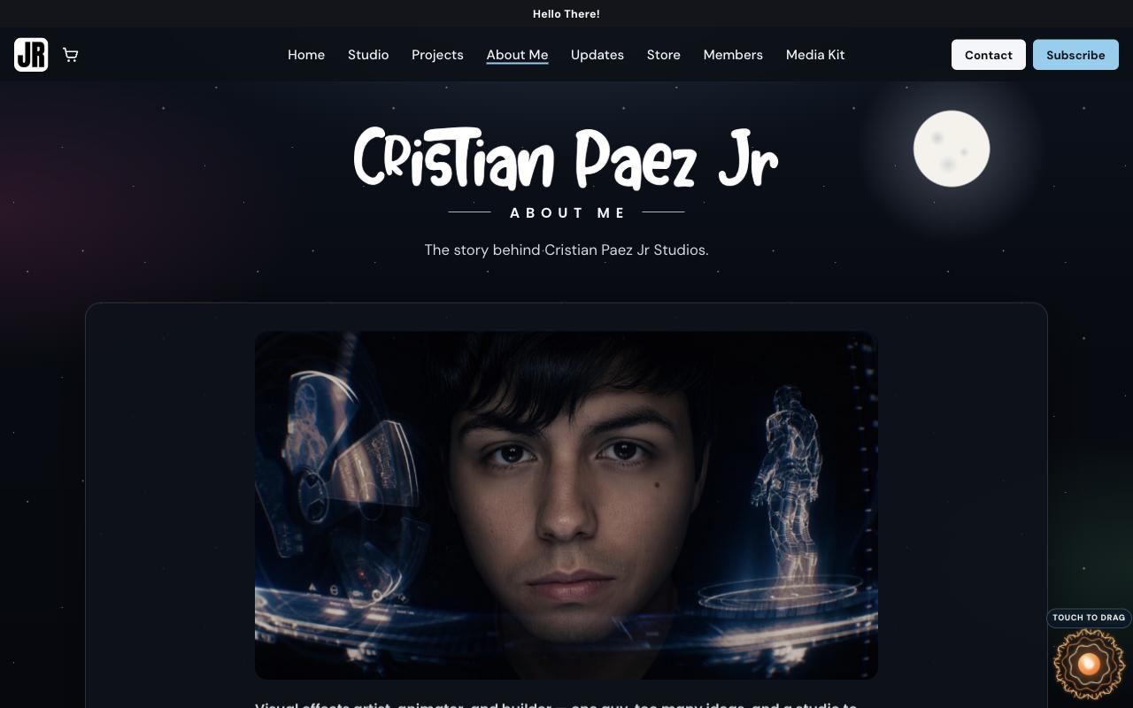
I also added two new tabs. Projects shows my latest web projects, apps, games, books, comics, music, and podcasts all in one spot. About Me is the same story from my Media Kit, so you don’t have to go digging for it.
My J.A.R.V.I.S. moment
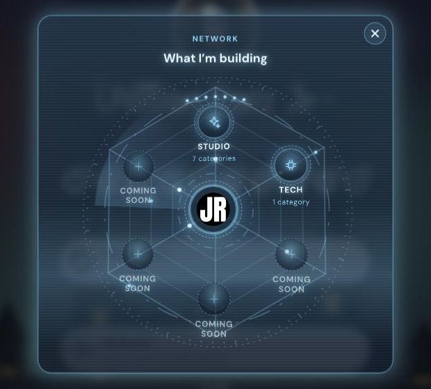
This one’s my favorite. The menu on my home page has a new Network button that opens a hologram web of everything I’m building. My JR logo sits in the middle (tap it and it opens the Studio), and everything branches out from there.
Studio opens up Books, Apps, Comics, Music, Podcast, Web Projects, and Art, and tapping any of them shows you where it lives. Tech holds my code on GitHub and GitLab. The rest are Coming Soon nodes, because I’m nowhere near done making stuff. And yes, it’s 100% Tony Stark workshop energy. You already knew that was coming.
There’s a Projects pop-up in the menu too, so you can take a quick look at what’s new without leaving the page.
The links page keeps changing (on purpose)
All the seasonal themes are lined up now. Right now, there’s a witch flying across the moon for Halloween. In November, the trees lose their leaves until the snow takes over. December is all Avengers: Doomsday (and Christmas, obviously). Then New Year’s takes you to New York, with the Times Square ball dropping a little lower every day.
On December 31, there’s even a radio playing for the countdown. If it closes, a little baby blue “Click Me! ^.^” tab slides out under the menu to bring it back. After that, February is Central Park for Valentine’s Day, and March is cherry blossoms in Washington, DC.
So why is THIS time different?
Because the style finally matches what I actually am: a digital content production and technology studio. That’s literally on the browser tab now, and my Media Kit has Production Studio and Tech Studio right at the front.
Last time, “done” meant the site worked. This time, done means I open it and don’t want to change a thing. The baby blue, the night mode, the hologram stuff, the seasonal themes… it all looks like me now. I’m happy with it. Like, ACTUALLY happy with it.
Will I still fix bugs? Obviously. Will the links page keep changing with the seasons? That’s the whole point. But the style is locked in. No more redesigns, no more “one tiny thing.” From here on, it’s all about the studio: videos, drops, and whatever ends up in those Coming Soon nodes.
Peace. (For real this time.)
Comments